Zircon - an extensible, multiplatform and user-friendly tile engine.

Getting Started
If you want to work with Zircon you can add it to your project as a dependency. Zircon is on Maven Central so adding it is rather simple:
from Maven:
<dependencies>
    <dependency>
        <groupId>org.hexworks.zircon</groupId>
        <artifactId>zircon.core-jvm</artifactId>
        <version>2020.2.0-RELEASE</version>
    </dependency>
    <dependency>
        <groupId>org.hexworks.zircon</groupId>
        <artifactId>zircon.jvm.swing</artifactId>
        <version>2020.2.0-RELEASE</version>
    </dependency>
</dependencies>
or you can also use Gradle:
dependencies {
    implementation("org.hexworks.zircon:zircon.core-jvm:2020.2.0-RELEASE")
    implementation("org.hexworks.zircon:zircon.jvm.swing:2020.2.0-RELEASE")
}
Want to use a PREVIEW version instead?
Check this documentation page.
Some rules of thumb
Before we start there are some guidelines which can help you if you are stuck:
- If you want to build something (a
TileGraphics, aComponentor anything which is part of the public API) it is almost sure that there is aBuilderor aFactoryfor it. The convention is that if you want to create aTileyou can use the factory functions defined on said class. If there are multiple classes of objects which can be created there might also be an utility class (likeShapesto create differentShapeobjects. Your IDE will help you with this. These classes reside in theorg.hexworks.zircon.apipackage. There are some classes which are grouped together into a single utility class however. WithComponentsyou can obtainBuilders for allComponents likeComponents.panel()orComponents.checkBox(). Likewise you can useDrawSurfacesto obtain builders forTileGraphicsandTileImage. - If you want to work with external files like tilesets or REXPaint files check the same package
(
org.hexworks.zircon.api), and look for classes which end with*Resources. There are a bunch of built-in tilesets for example which you can choose from but you can also load your own. The rule of thumb is that if you need something external there is probably a*Resourcesclass for it (like the [CP437TilesetResources]). - You can use anything you can find in the API package, they are part of the public API, and safe to use. The internal package however is considered private to Zircon so don’t depend on anything in it because it can change any time.
- Some topics are explained in depth on the documentation.
- If you want to see some example code look here.
- If all else fails read the javadoc. API classes are well documented.
- If you have any problems which are not answered here feel free to ask us at the Hexworks Discord server.
Creating an Application
In Zircon almost every object you might want to use has a helper class for building it. This is the same for Applications as well so let’s create one using the SwingApplications class:
Note that these examples reside in the
org.hexworks.zircon.examples.docspackage in thezircon.examplesproject, you can try them all out.
import org.hexworks.zircon.api.SwingApplications;
import org.hexworks.zircon.api.application.Application;

public class CreatingAnApplication {

    public static void main(String[] args) {

        Application application = SwingApplications.startApplication();
    }
}
Running this snippet will result in this screen:
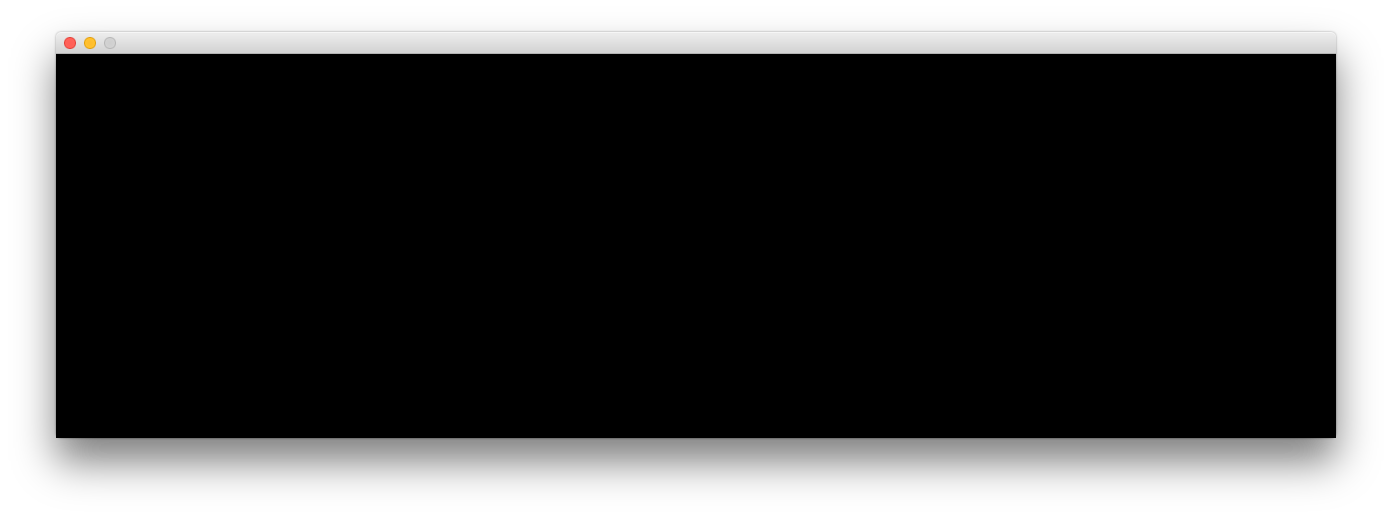
Not very useful, is it? So what happens here? An Application is just an object which has a Renderer for rendering Tiles on your screen), and a TileGrid, which is the main interface which you will use to interact with Zircon. An Application is responsible for continuously rendering the contents of the grid on the screen. Here we use the Swing variant, but there are other types in the making (one for LibGDX, and one which works in the browser).
Since most of the time you don’t care about the Application itself, there is a function for creating a TileGrid directly:
TileGrid tileGrid = SwingApplications.startTileGrid();
Now let’s see how we can specify how a TileGrid is created. We’ll use the [AppConfig] for this:
TileGrid tileGrid = SwingApplications.startTileGrid(
        AppConfig.newBuilder()
                .withSize(10, 10)
                .withDefaultTileset(CP437TilesetResources.rexPaint16x16())
                .build());
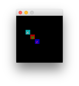
Adding and formatting Tiles is very simple:
TileGrid tileGrid = SwingApplications.startTileGrid(
        AppConfig.newBuilder()
                .withSize(10, 10)
                .withDefaultTileset(CP437TilesetResources.rexPaint16x16())
                .build());

tileGrid.draw(
        Tile.newBuilder()
                .withBackgroundColor(ANSITileColor.CYAN)
                .withForegroundColor(ANSITileColor.WHITE)
                .withCharacter('x')
                .build(),
        Position.create(2, 3));

tileGrid.draw(
        Tile.newBuilder()
                .withBackgroundColor(ANSITileColor.RED)
                .withForegroundColor(ANSITileColor.GREEN)
                .withCharacter('y')
                .build(),
        Position.create(3, 4));

tileGrid.draw(
        Tile.newBuilder()
                .withBackgroundColor(ANSITileColor.BLUE)
                .withForegroundColor(ANSITileColor.MAGENTA)
                .withCharacter('z')
                .build(),
        Position.create(4, 5));
Running the above code will result in something like this:
As you can see there are factory methods for every class which you might want to use. Here we used Position.create
to create a Position, Size.create for creating Sizes and the TileBuilder to create tiles.
A Position denotes a coordinate on a TileGrid, so for example a Position of (2, 3) points to the 3rd
column and the 4th row (x, y) on the grid.
Note that
Positionindexing starts from zero.
Conversely a Size denotes an area with a width and a height. These two classes are used throughout Zircon.
A Tile is the most basic graphical unit Zircon supports. In most cases it is a simple character with a foreground and a background color (like in the example above).
In addition to colors and characters you can also use Modifiers in your Tiles.
A lot of fancy stuff can be done with Modifiers, like this: helper for this:
If interested check out the code examples here.
Tileset (and by extension resource) handling in Zircon is very simple and if you are interested in how to load your custom fonts and other resources take a look at the Resource handling wiki page.
Working with Screens
TileGrids alone won’t suffice if you want to get any serious work done since they are rather rudimentary.
A Screen has its own buffer and it can be displayed on
a TileGrid any time. This means that you can have multiple Screens at the same time representing your actual
game screens. Note that only one Screen can be displayed at a given moment. displaying one deactivates
the previous Screen.
Let’s create a Screen and fill it up with some stuff:
TileGrid tileGrid = SwingApplications.startTileGrid(
        AppConfig.newBuilder()
                .withSize(20, 8)
                .withDefaultTileset(CP437TilesetResources.wanderlust16x16())
                .build());

final Screen screen = Screen.create(tileGrid);

final ColorTheme theme = ColorThemes.adriftInDreams();

final TileGraphics image = DrawSurfaces.tileGraphicsBuilder()
        .withSize(tileGrid.getSize())
        .withFiller(Tile.newBuilder()
                .withForegroundColor(theme.getPrimaryForegroundColor())
                .withBackgroundColor(theme.getPrimaryBackgroundColor())
                .withCharacter('~')
                .build())
        .build();

screen.draw(image, Position.zero(), image.getSize());

screen.display();
and we’ve got a nice ocean:
What happens here is that we:
- Create a Screen
- Fetch a nice ColorTheme which has colors we need
- Create a TileGraphics with the colors added and fill it with
~s - Draw the graphic onto the Screen
For more explanation about these jump to the Zircon Crash Course.
You can do so much more with Screens. If interested then check out A primer on Screens on the documentation!
Components
Zircon supports a bunch of Components out of the box:
Button: A simple clickable component with corresponding event listeners.CheckBox: Like aButtonbut with checked / unchecked state.Header: Like a label but this one has emphasis (useful when using ColorThemes).Label: Simple component with text.LogArea: Component with a list of items. New items can be added, and they will be srolled.Panel: A Container which can hold multiple Components.RadioButtonGroupandRadioButton: Like aCheckBoxbut only one can be selected at a time.TextArea: Similar to a text area in HTML this Component can be written into.TextBox: ATextBoxis more like a hypertext document where you can add elements with semantic. meaning. It supports addingHeaders,Paragraphs,ListItems and evenButtons.
These components are rather simple and you can expect them to work in a way you might be familiar with:
- You can click on them (press and release are different events).
- You can attach event listeners on them.
- Zircon implements focus handling so you can navigate between the components using the
[Tab]key (forwards) or the[Shift]+[Tab]key stroke (backwards). - Components can be hovered and they can change their styling when you do so.
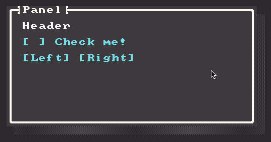
Let’s look at an example (notes about how it works are in the comments):
final TileGrid tileGrid = SwingApplications.startTileGrid(
        AppConfig.newBuilder()
                .withSize(34, 18)
                .withDefaultTileset(CP437TilesetResources.aduDhabi16x16())
                .build());
final Screen screen = Screen.create(tileGrid);

Panel panel = Components.panel()
        .withDecorations(
                // panels can be wrapped in a box
                box(BoxType.SINGLE, "Panel"),
                shadow()) // shadow can be added
        .withSize(32, 16) // the size must be smaller than the parent's size
        .withPosition(1, 1)
        .build(); // position is always relative to the parent

final Header header = Components.header()
        // this will be 1x1 left and down from the top left
        // corner of the panel
        .withPosition(1, 1)
        .withText("Header")
        .build();

final CheckBox checkBox = Components.checkBox()
        .withText("Check me!")
        .withPosition(Position.create(0, 1)
                // the position class has some convenience methods
                // for you to specify your component's position as
                // relative to another one
                .relativeToBottomOf(header))
        .build();

final Button left = Components.button()
        .withPosition(Position.create(0, 1) // this means 1 row below the check box
                .relativeToBottomOf(checkBox))
        .withText("Left")
        .build();

final Button right = Components.button()
        .withPosition(Position.create(1, 0) // 1 column right relative to the left BUTTON
                .relativeToRightOf(left))
        .withText("Right")
        .build();

panel.addComponent(header);
panel.addComponent(checkBox);
panel.addComponent(left);
panel.addComponent(right);

screen.addComponent(panel);

// we can apply color themes to a screen
screen.setTheme(ColorThemes.monokaiBlue());

// this is how you can define interactions with a component
left.handleComponentEvents(ACTIVATED, (event) -> {
    screen.setTheme(ColorThemes.monokaiGreen());
    return UIEventResponse.processed();
});

right.handleComponentEvents(ACTIVATED, (event) -> {
    screen.setTheme(ColorThemes.monokaiViolet());
    return UIEventResponse.processed();
});

// in order to see the changes you need to display your screen.
screen.display();
And the result will look like this:
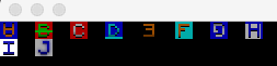
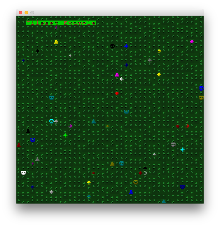
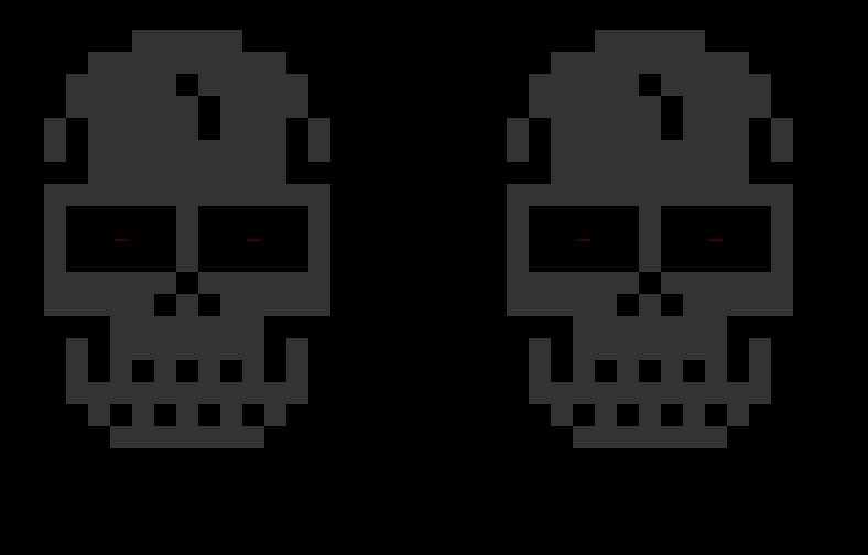
You can check out more examples here. Here are some screenshots of them:
Tileset example:
Animations:
Components:
Additional features
There are a bunch of other things Zircon can do which are not detailed in this README but you can read about them in either the source code or the documentation:
Layering
Both the TileGrid and the Screen interfaces implement Layerable which means that you can add Layers on top of them. Every Layerable can have an arbitrary amount of Layers. Layers are like TileGraphics and you can also have transparency in them which can be used to create fancy effects. Components are also Layers themselves. For more details check the how-layers-work documentation page.
Note that when creating
Layers you can set theiroffsetfrom the builder but after attaching it to aTileGridorScreenyou can change its position by callingmoveTowith a newPosition.
Input handling
Both the TileGrid and the Screen interfaces implement UIEventSource which means that they re-emit all inputs from your users (key strokes and mouse actions) and you can listen on them. There is a doc page with more info.
Shape and box drawing
You can draw Shapes like rectangles and triangles by using one of the ShapeFactory implementations. Check the corresponding documentation page for more info.
Fonts and tilesets
Zircon comes with a bunch of built-in fonts tilesets. These come in 2 flavors:
- CP437 tilesets (More on using them [here][resource-handling#cp437-tilesets])
- True Type Fonts
- and Graphic tilesets (Usage info [here][resource-handling#graphical-tilesets])
Read more about them in the resource handling documentation page if you want to know more or if you want to use your own tilesets and fonts.
Zircon also comes with its own tileset format (ztf: Zircon Tileset Format) which is very easy to use.
It is detailed [here][resource-handling#graphical-tilesets].
REXPaint file loading
REXPaint files (.xp) can be loaded into Zircon Layers. Read about this feature
[here][resource-handling#rexpaint-files].
Color themes
Zircon comes with a bunch of built-in color themes which you can apply to your components. If interested you can read more about how this works here.
Animations (BETA)
Animations are a beta feature. More info here.
The API
If you just want to peruse the Zircon API just navigate here. Everything which is intended to be the public API is there.