If you want to have text GUI controls in your application then Zircon has you covered with the
Componentabstraction.
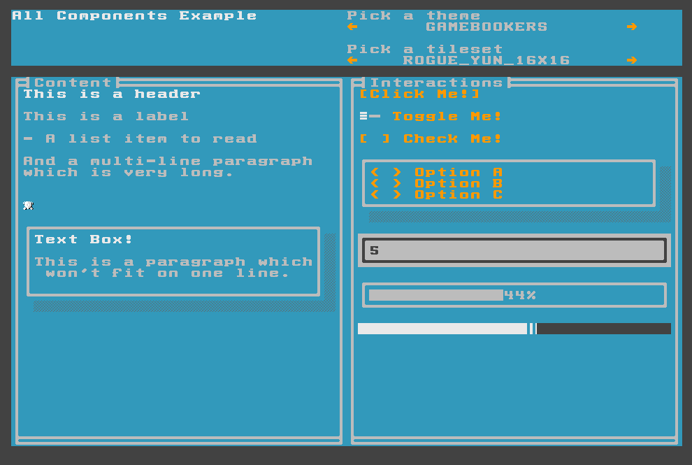
Components in Zircon are text GUI elements which come in 3 flavors: there are components which you can use to display content, like Labels, Paragraphs and ListItems. You also have Components which can be used for interaction, such as Buttons, ToggleButtons and RadioButtons. Apart from the ones above there are also Containers which can have other Components as their children.
How Components Work
Peruse the Component Examples package if you want to look at some actual code!
Components work in a similar way as Layers do. They have graphical content which is backed by a TileGraphics object and they can also be moved around like Layers. The main difference between them is that their structure is hierarchical: they form a tree. Components serve as leaf objects in this tree and Containers can have child Components. Components are also rendered. They don’t exist in-memory like Layers, but they are rendered by the Application continuously.
To read more about Layers you can go to the relevant documentation page.
This is how the Component interface looks like:
interface Component : ComponentEventSource, ComponentProperties, Focusable, Movable, UIEventSource {

    val absolutePosition: Position

    val relativePosition: Position

    val contentOffset: Position

    val contentSize: Size

    val componentState: ComponentState

    val currentStyle: StyleSet

    var componentStyleSet: ComponentStyleSet
}
This might look rather overwhelming at first but it will make sense soon. Let’s take a look at what properties are there in a Component.
absolutePosition is the Position of a Component relative to the top left corner of the Screen. Conversely relativePosition is the Position of the Component relative to its parent Container.
contentOffset denotes the Position where the actual content of the Component starts relative to the top left corner of it. This will be explained later when we talk about component decorations. contentSize is the size of the area where the contents of the Component will be drawn.
componentState contains the possible states a Component can be in:
enum class ComponentState {
    DEFAULT,
    HIGHLIGHTED,
    FOCUSED,
    DISABLED,
    ACTIVE
}
What they mean is:
- All Components are in the
DEFAULTstate when they are created and the user is not interacting with them - A Component is
HIGHLIGHTEDwhen you move your mouse over it - Whenever you navigate to a Component using the navigation keys (
[Tab]and[Shift]+[Tab]by default) they becomeFOCUSED. Only one Component can be focused at any given time. - Components can be
DISABLED. In this state they won’t receive any events and they will also be visually different (grayed out). - A Component is
ACTIVEwhen you are pressing the mouse over it, or if you are pressing the activation key ([Spacebar]by default).
A Component also becomes focused when you click on it.
A ComponentStyleSet holds StyleSets for every possible ComponentState. Whenever a Component’s state changes it will be redrawn with the appropriate StyleSet from the ComponentStyleSet.
Apart from being disabled Components can also be hidden, they can have their own tilesets for drawing them. Take a look at TilesetOverride to see how you can change tilesets.
Each Component will decide on its own how it uses the ComponentStyleSet for drawing. This enables Zircon to have Components that are visually consistent:
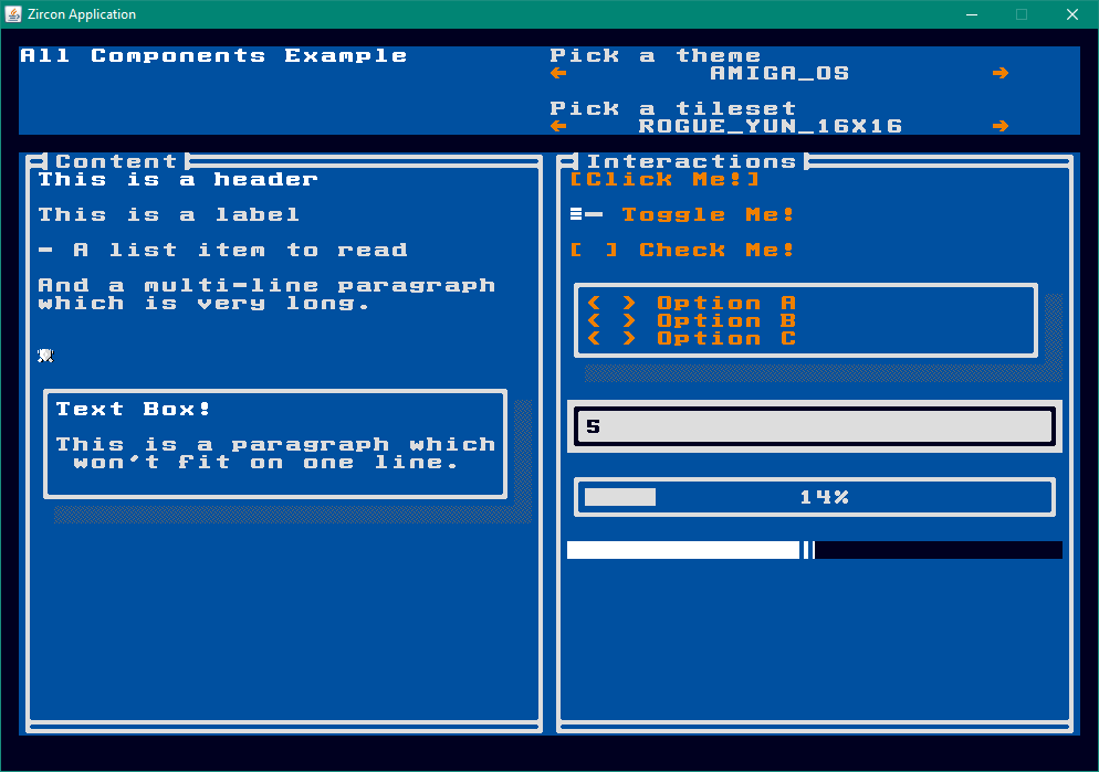
Components also support applying ColorThemes to them. You can read more about it here. They are a simple way of applying consistent styling to all your Components. Take a look at this example:
Event Handling
Handling events work in a similar way as with TileGrids. In fact Components implement UIEventSource so you can listen to all events you have on TileGrids.
The only difference is that you’ll get only those events which happened in the context of the Component. For example you will only get MOUSE_MOVED events if the mouse is over the Component.
Apart from regular events you can also work with ComponentEvents.
If you’re not familiar with how the event system works check out the relevant documentation page here.
There are 4 kinds of ComponentEvents you can listen to:
enum class ComponentEventType : UIEventType {
    FOCUS_GIVEN,
    FOCUS_TAKEN,
    ACTIVATED,
    DEACTIVATED
}
FOCUS_GIVENwill be called whenever the Component gets focusFOCUS_TAKENis the opposite ofFOCUS_GIVEN- The
ACTIVATEDevent is fired when the activation key is pressed ([Spacebar]by default), or if you press on the Component. DEACTIVATEDis fired when you release the key, or the button
Listening to these events is pretty straightforward:
screen.addComponent(button()
        .withText("Click me!"))
        .onActivated(Functions.fromConsumer((event) -> {
            System.out.println("Hey, I was clicked.");
        }));
There are also methods for listening to the rest of the component events (
onFocusGiven,onFocusTakenandonDeactivated).
Creating Components
We’ve learned a lot about Components but we don’t yet know how to create them! For this purpose Zircon supplies a factory object: Components.
You can use the factory methods in this class to create a Builder for all built-in Components:
ButtonBuilder builder = Components.button();
You can use these builders to set up the Component you’re trying to create. All Components must have a Position, a Size and a ComponentRenderer. Luckily the builder classes come with pre-configured defaults, so in most cases you don’t have to bother with them. Let’s take a look at a more complex example:
AttachedComponent attachment = screen.addComponent(button()
        .withText("Click Me!") // 1
        .withAlignment(ComponentAlignments.alignmentWithin(screen, ComponentAlignment.CENTER)) // 2
        // 3
        .withDecorations(ComponentDecorations // 4
                .box(BoxType.SINGLE, "", RenderingMode.INTERACTIVE))
        .build());
attachment.onActivated(Functions.fromConsumer((event) -> { // 5
    attachment.detach(); // 6
}));
If you run this code you’ll see this:

Let’s see what is happening here:
- Most Components support adding text to them. The Button is no different.
- We can align Components in multiple ways. In this example we align it within its parent, the
screen. - We don’t need to set a Size for a Component. In this case Zircon will automatically figure out the right size.
- Components support adding decorations to them. For this we can use the ComponentDecorations factory object. Here we create a
box. More on decorations later. - When we add a Component to a Container it gets attached and we get an
AttachedComponentobject back. This class adds functionality on top of Component which is only relevant for Components which are attached to a parent. - Here we
detachour Component which means that it will no longer be the part of the Component tree (it is removed from the Screen).
Aligning Components
Components can be aligned in multiple ways. In the example above we’ve seen how to align by creating an alignment object using ComponentAlignments. This class supports other options as well:
    fun alignmentWithin(tileGrid: TileGrid,
                        alignmentType: ComponentAlignment): AlignmentStrategy

    fun alignmentWithin(container: Container,
                        alignmentType: ComponentAlignment): AlignmentStrategy

    fun alignmentAround(component: Component,
                        alignmentType: ComponentAlignment): AlignmentStrategy

    fun positionalAlignment(x: Int, y: Int): AlignmentStrategy
alignmentWithinwill align the Component within its parent. It can be centered, or aligned around the corners.alignmentAroundwill produce alignments around the target Component.positionalAlignmentwill set an absolute Position.
This example explores all the alignment options.
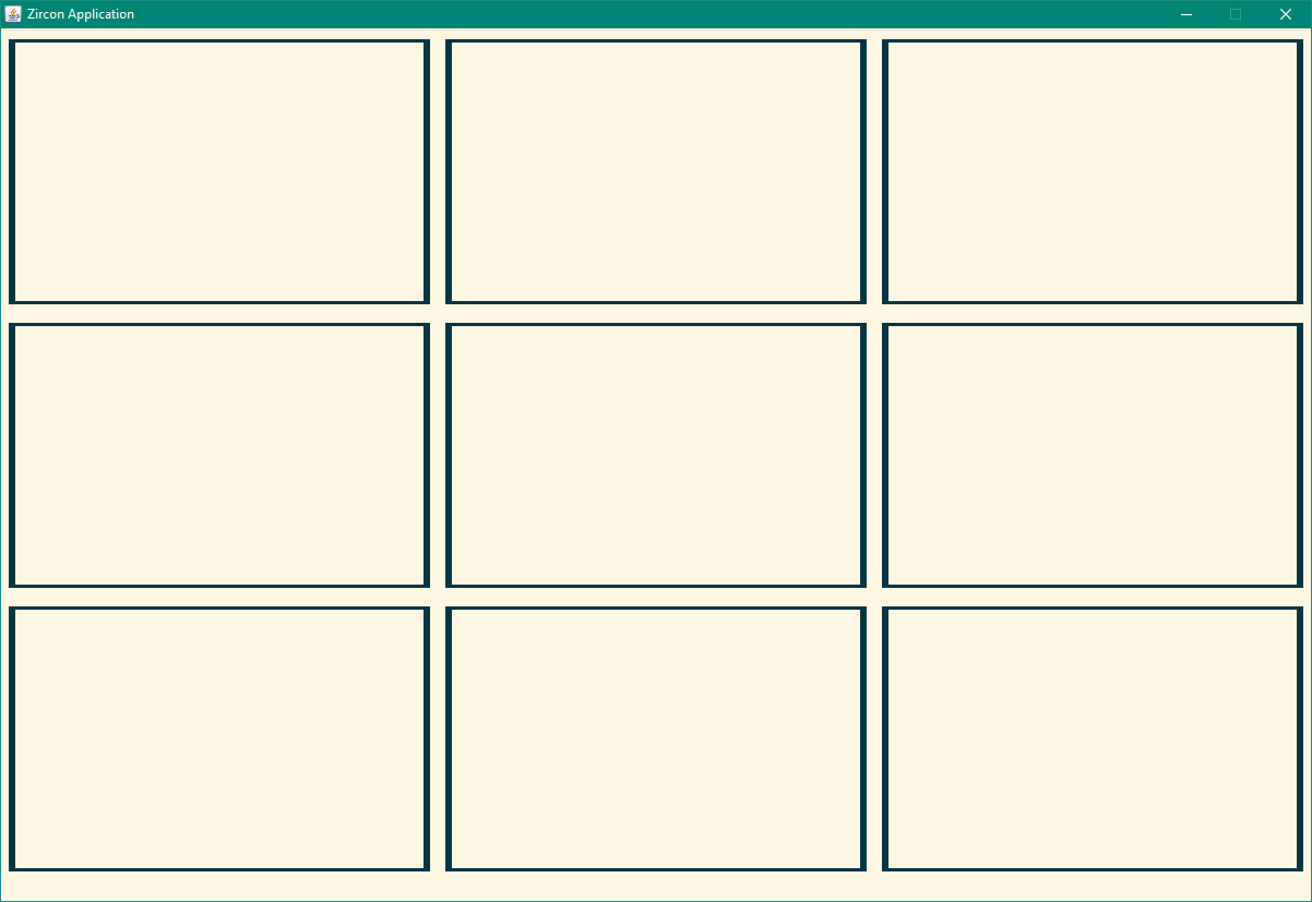
Another option is to use Containers which will auto-align their children: HBox and VBox. As their name suggests HBox will align their children horizontally, while VBox aligns vertically.
These can also be nested to be able to create complex layouts easily:
HBox columns = hbox()
        .withSize(screen.getSize())
        .build();

Size columnSize = columns.getSize().withWidth(columns.getSize().getWidth() / 3);

for (int i = 0; i < 3; i++) {

    Size boxSize = columnSize.withHeight(columnSize.getHeight() / 3);

    VBox column = vbox().withSize(columnSize).build();
    columns.addComponents(column);

    for (int j = 0; j < 3; j++) {

        column.addComponent(panel()
                .withSize(boxSize)
                .withDecorations(box())
                .build());
    }
}

screen.addComponent(columns);
which will result in this:
Decorating Components
In the previous examples we’ve used box decorations. But how do they work in practice? What happens when you create a Component is that the builder calculates the necessary space required for the content and adds the size of the decorations to it to arrive at the final Size for the Component.
You can see this in action in the Button example above. You can also set a Size by hand. In this case the size of all decorations are added together and the final contentSize will be the remaining space which is left. The contentPosition is calculated by adding up the space consumed by decorations on the top-left side of the Component. This means that a box() will give a contentPosition of (1, 1) because it offsets content with just 1 Tile on each side. A shadow() on the other hand won’t offset the content, and will take up space only on the bottom-right side:
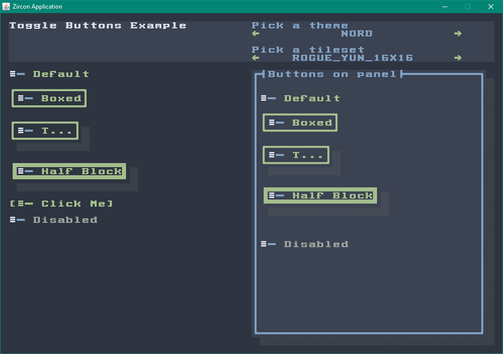
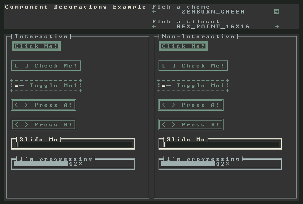
Decorations can also be INTERACTIVE and NON_INTERACTIVE. In INTERACTIVE mode the decorations will inherit the current style of the Component they wrap. In NON_INTERACTIVE mode they will keep using the DEFAULT style (DISABLED if the Component is disabled):
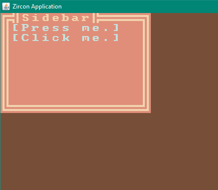
Fragments
A Fragment is a Component combined with some view logic. You can add them to any ComponentContainer the same way as you do with Components. You can use this abstraction to create reusable parts for your UI without having to write a new Component from scratch:
class Sidebar implements Fragment {

    private VBox root;

    Sidebar(List<Button> buttons, Size size, String title) {
        root = vbox()
                .withSize(size)
                .withDecorations(box(BoxType.DOUBLE, title))
                .build();
        buttons.forEach(root::addComponent);
    }

    public Component getRoot() {
        return root;
    }
}

Button btn0 = button().withText("Press me.").build();
Button btn1 = button().withText("Click me.").build();

screen.addFragment(new Sidebar(Arrays.asList(btn0, btn1), Size.create(15, 10), "Sidebar"));
It will look like this:
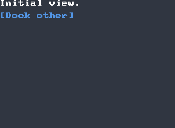
Using Views
Views are like Fragments, but for Screens. With this abstraction you can create reusable full-screen views:
ColorTheme theme = ColorThemes.arc();

TileGrid tileGrid = startTileGrid();

class InitialView extends BaseView {

    public Button dockOther = Components.button()
            .withText("Dock other")
            .withPosition(0, 2)
            .build();

    public InitialView(@NotNull TileGrid tileGrid, @NotNull ColorTheme theme) {
        super(tileGrid, theme);
        getScreen().addComponent(Components.header().withText("Initial view."));
        getScreen().addComponent(dockOther);
    }

    @Override
    public void onDock() {
        System.out.println("Docking Initial View.");
    }

    @Override
    public void onUndock() {
        System.out.println("Undocking Initial View.");
    }
}

class OtherView extends BaseView {

    public Button dockInitial = Components.button()
            .withText("Dock initial")
            .withPosition(12, 2)
            .build();

    public OtherView(@NotNull TileGrid tileGrid, @NotNull ColorTheme theme) {
        super(tileGrid, theme);
        getScreen().addComponent(Components.header().withText("Other view."));
        getScreen().addComponent(dockInitial);
    }

    @Override
    public void onDock() {
        System.out.println("Docking Other View.");
    }

    @Override
    public void onUndock() {
        System.out.println("Undocking Other View.");
    }
}

InitialView initial = new InitialView(tileGrid, theme);
OtherView other = new OtherView(tileGrid, theme);

initial.dockOther.onActivated(Functions.fromConsumer((event) -> other.dock()));

other.dockInitial.onActivated(Functions.fromConsumer((event) -> other.replaceWith(initial)));

initial.dock();
Running this will result in the following:
Conclusion
This concludes the introductory material for Components. If you want to see more examples on how to work with Components you can navigate to the java component examples directory in the Zircon repo. Each example is inclusive and can be run as an application.
If you’re using Kotlin check out the Kotlin code examples for components here.